Sunday, October 9, 2011

Mount Hope Cemetery


Before the 19th century, the standard place of burial involved an overcrowded churchyard stuck in the middle of a city. Not exactly a location one would enjoy visiting to pay respects to a loved one, these "places of rest" were much more chaotic and crumbling than peaceful or inviting.
In 1804, the first landscaped cemetery was opened in Paris, Pere Lachaise.
This marked the beginning of the rural or garden cemetery, in which architectural design and landscaping of the location earned much lager roles in their development. Natural features such as trees, flowers, and ponds became much more crucial in the design of a sufficient resting place, as well as the flow of the land and its natural beauty and flow. This new fascination and concern with placing the deceased in a much more aesthetically pleasing and inviting environment coincided with the emerging popular tastes of the time, which included a focus on the romantic and aesthetic. There was also an increase in the richness and variety of the monuments within the cemeteries due to the introduction of mechanized manufacturing processes during this time.


Dedicated in 1838, Mount Hope Cemetery in Rochester, NY is one of the first park or garden style cemeteries, and is the oldest Municipal Victorian Cemetery in America.
With 350,000 graves among the picturesque 196 acres, this cemetery holds many examples of stone deterioration and conservation.

A maze of interconnected hills and valleys, the landscape was formed 13,000 years ago, as glaciers began to melt and move across the land, debris collected by the ice was deposited in large piles that formed the beautiful landscape we see today.

Constantly exposed to the elements, grave markers show very obvious signs of weathering, deterioration, and decay.
This stone has been chosen to be observed according to Applebaum's quandrant chart.

In general, gravestones such as this face many forms of deterioration, both environmentally and chemically. Weathering, lichen, and moss can occur naturally and are a danger to these stones that are left out to face the elements at all times.
Frost spalling, or wedging, is another real danger for stone. This occurs when water fills small cracks and then freezes, which breaks the rock.

They also are victims of sugaring, which occurs when oxygen interacts with minerals and results in soluble salts with in the stone to move outwards and recrystallize on the surface, and gypsum crust, which forms when CaCO2 in the stone dissolves from acidic rain water and re-precipitates on the surface of the stone, forming a black crust.
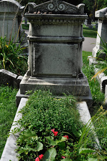
Common pollutants such as sulfur oxides, nitrogen oxides, and carbon dioxide can all dissolve in water, and will react with limestone, marble, and lime mortar. This especially occurs in urban areas where human activity has increased the number of such pollutants. If an affected gravestone is in an exposed area where rain can regularly wash away the reaction products, the surface of the stone will gradually recede. If the stone is sheltered, the reaction products will likely form a crust on the surface of the material. This is clearly seen on the sheltered areas of the Kaltenbacch grave marker.

Likely carved and placed in the cemetery in 1889 due to the date on the stone, the material appears to be marble, which is a metamorphic rock composed of recrystallized carbonate minerals, and is very commonly used for gravestones.

The stone shows signs of sugaring on its surface, shown by the small rough bumps that cover the surface.
There is also evidence of the formation of gypsum crust, which is shown by the black roughness that has spread across the stone.

Environmental effects have also taken a toll on this grave, as lichen and moss can be seen making their home on the stone. Cracks, possibly enlarged from water freezing and cracking the marble are prevalent. Smaller cracks also pose the danger of enlarging in the future from these conditions, and this is likely to happen due to the relentless Rochester weather.

There has also been some weathering on the intricate carvings on the stone, which have been rounded an smoothed out from wind and rain.
A missing acorn from the design can be seen here:
The stone also reveals a fair amount of history through its symbolism.
In the past, primaraly before the 17th century, gravestone iconography held fast to more Puritan views, which involved contempt towards ones life on earth, and a resignation in the face of death.
Between the 17th and 19th centuries, a shift towards the Romantic gave way to a much more hopeful and romanticized idea of death and the afterlife. In the late 1800s grave stone decoration reaches its peak, as stones become highly intricate and detailed.

For this particular grave, one can see signs of such intricacy and effort being put into the stone.
The letter "K" inscripted on the front of the stone, clearly in order to represent the deceased's last name and call upon her connection to the family.

The oak leaves around the outside are said to represent strength, endurance, faith, and virtue, and the acorns convey prosperity. All of these are meant to portray the family in a positive light.
At the top of the stone there are carvings of acanthus leaves, which symbolize the journey of life to death. The upside down torch on the side of the gravestone symbolizes "a life put out," but also the idea of the after life and an immortal soul due to the continuously burning flame.

Certainly not one of the oldest markers in this cemetery, the marble stone has retained the majority of its intricacies and has yet to succumb to the environmental and chemical deterioration that has caused clearly visible, yet minimal damage. It does not appear that any conservation of this stone has been necessary thus far. It is however possible that in the future a removal of the moss and lichens, or of the gypsum crust may be desirable for this particular grave stone.
Stone restoration and cleaning is a controversial topic due to the fact that there are a large number of factors that can result in additional damage to the stone." A number of authors have emphasized the damage that can be caused by cleaning: loss of surface, staining, deposition of soluble salts, or making the stone more vulnerable to pollutants or biological growths" (Price).


This beautiful and decorative memorial of the life of Marianne Keister is just one of many nestled among the grassy hills of Mount Hope that is doing its best to stand the tests of time.

Sources:
http://en.wikipedia.org/wiki/Rural_cemetery
http://nyfalls.com/mt-hope-cemetery.html
http://members.fortunecity.com/mccallister/symbols.txt
http://www.graveaddiction.com/symbol.html
Guidelines for Evaluating Cemeteries National Register Bulletin
http://www.digitalhistory.uh.edu/do_history/graveyards/index.cfm
Price C. Stone Conservation


Sunday, May 8, 2011

albumen

The albumen process was invented in 1850 by Louis Desire Blanquart-Evrard. It was the first time that producing a print on a paper base from a negative became commercially exploitable. This resulted in its popularity for use as the method for printing the carte de visit, a trend in the mid 19th century of buying and trading small prints of friends, family, and famous persons. The print has a slight gloss which contributed to its appeal and made it unique in comparison to other processes of the time period.

The process involves an emulsion made of egg whites and salt, which the paper is dipped into and then dried. Before exposing, the paper is dipped in a solution of silver nitrate and water which activates the emulsion and allows the paper to become light sensitive. After drying again, the paper can be exposed to UV light with a negative in order to produce the image. The result is a brown colored print.
The fixing process involves Herschels standard fixing method involving solutions of hype and a rinse of water.

My experience: Following the same methods as the traditional recipe calls for, we coated the paper, hung it to dry, activated the emulsion, and exposed the image for a few minutes outside. The final result was a brown image with relatively wide tonality range and a slight gloss. We had trouble with the double coating, so my image only had one coat of albumen which had a less noticeable gloss than some of those that had two coats.
The process is also outlined in a previous blog entry


cyanotype


The cyanotype process was invented by Herschel in 1842, mainly as a means to reproduce notes and diagrams. The process was published as a last minute addition to another larger paper he had written. Herschel came across the process while experimenting and corresponding with a friend, Alfred Smee, a chemical correspondent to the Bank of England who had taken some interest in photography. Originally not very successful because of the limited tonal range and Prussion blue color, the process did not really become as popular until its success in the 20th century.

The process made Anna Atkins somewhat famous and gives her the title as the first female photographer when she used the process to photograph a series of British seaweeds, compiling them into a book entitled British Algae.


The coating solution is made up of two separate solutions which are mixed
Mixing cyanotype chemicals
together before coating the material. Solution A is made up of 25 grams of Ferric ammonium citrate and 100mL of water. Solution B is 10grams of Potassium ferricyanade and 100mL of wawater. Equal quantities of each solution are then mixed together in a third container, but need to be used with about a half hour because the solution does not last very long once mixed.
After evenly coating the paper and allowing it to dry, a negative can be placed over the paper and both should be exposed to UV, light generally natural sunlight. Depending on cloud coverage, number of coats, and the density of the negative, the exposure can take from a few minutes up to an hour. The paper should be exposed until the image looks as if it is getting lighter instead of darker and the blue is starting to fade. This is one of the longer process for exposure.
Fixing the image is as simple as running water of the paper for several minutes until the residual chemicals are removed. This simple fixing method that does not require the use of hypo is another reason for the popularity of the cyanotype.

The cyanotype "became the most commercially successful of all of Herschel's processes; indeed, it is the only process from the first decade of photography to survive in active use well into the twentieth century..." Mostly used for acrchitectural blueprinting, the cyanotype process has become a craft project and exciting way for amateur image makers and everyday creative persons to express themselves using such a cheap and simple method. Cyanotype fabrics with the high contrast of white shapes over the deep blue are a stunning way to transform fabric into a work of art. This set of chair seats and pillow cases is an example of such innovation.


My experience:
After preparing solutions A and B and mixing the two together in a separate container, 100% rag paper was coated with the green colored solution and then allowed to dry. We then applied a second coat and also let it dry.
I had two different negatives so both images were brought outside with the negative ink side facing the coated side of the paper. It was a very sunny day, but the cyanotypes still take a long time to expose so we were outside for about 20 minutes until the blue of the images started to fade.
The images were then fixed by running them under water for about five minutes. I left one image just as was, with only the water fixative:
For the other print, and two strips that i cut off of it, I used the other three toning solutions. The first was soaked in a mixture of tea and water, which was supposed to produce a darker blue effect. The strip I put in that solution was already pretty dark blue so it did not really have much of an effect.
I soaked the actual print in the tea solution first, and the strong bleach solution which resulted in a brownish tone, but I did not really like the final result.
The other strip was soaked in the weak ammonia first, and then in the tea solution. This was supposed to result in a blue-yellow tone, but I did not really achieve that result and instead ended up with a faded blue color.


2nd toner, 3rd toner, 1st toner.


Friday, May 6, 2011

Vandyke Brown


The vandyke brown print was invented by Herschel in 1842, getting its name from the print color's similarity to the deep brown pigment painter Van Dyck was known to use. The process is quite simple and is very similar to the first iron-silver process, the argentotype, which was also invented by Herschel and gave him credit for being the first to form an image with an iron sensitizer. "Both utilize the photosensitivity of iron salts as well as the ability of ferrous ions [iron(II)] to reduce silver ions to silver metal." The vandyke process is essentially his perfection of the argentotype.

The formula for the process is as follows:

        Solution A
        Ferric Ammonium Citrate 9.0 gm
        Distilled Water 33.0 ml

        Solution B
        Tartaric Acid 1.5 gm
        Distilled Water 33.0 ml

        Solution C
        Silver Nitrate 3.8 gm
        Distilled Water 33.0 ml

Combine Solutions A and B and slowly add C while stirring. Pour the sensitizer in a brown bottle and let it age for a few days before using. Keep it stored in a dark place. I keep mine in a covered box. I have used sensitizer that had been sitting around for a year or so and it was fine. Care should be taken when mixing.

After evenly coating the paper and allowing it to dry, the negative and coated paper should be exposed in UV light (the sun), depending on cloud coverage, density of the negative, and number of coats of emulsion, this could take only a couple of minutes, or ten to fifteen.

After exposure, the image will darken greatly once it has gone through the fixing process, and will darken even more once it has dried.

Path to Odaru, Kawazu, Izu, 12/26/89"Prints are immersed in water and then checked to make sure that there are no bubbles on the surface. They are then transferred to the reducer and agitated until the desired density is achieved. Reduction seems to be most pronounced in the lighter areas so great care must be taken to avoid wiping out delicate highlight details. This reducer has a tendency to increase overall contrast. After reduction prints are treated in a hypo clearing agent for three minutes and then washed for thirty minutes."

The process is relatively low in cost, making it quite popular, and one can achieve different tones by adding Kodak Polytoner, gold selenium, sepia, berg Copper, or Berg Blue in order to achieve purples, pinks, and blues. Unfortunately the downside to vandyke prints is that they are prone to fading after prolonged exposure to UV light.

"I was first drawn to the Vandyke process when I became dissatisfied with the lack of variety and character of the baryta base of conventional gelatin-silver photographic papers. I wanted to make prints on some of the many beautiful and interesting papers that are available to printmakers and watercolorists and first worked with salted paper but with limited success and considerable frustration."

My experience:

Our solution for coating the paper was mixed beforehand so that it could sit for a few days as the formula calls for. after coating the 100% rag paper once and allowing it to dry, the coated paper was brought outside with the negatives.
I used one cyanotype negative and one salted paper negative. It was an overcast day, so we stayed outside for about fifteen minutes in order to allow the images to properly expose.
We then brought them inside to be fixed, starting with a rinse of water and citric acid for five minutes, running water for about two minutes, a 3% hypo mixture for one minute, and then another minute in another batch, concluding with a final wash in water for about 40 minutes.

The resulting prints were in fact darker once they had dried, and they definitely showed a wider tonal range than some of the other processes, such as cyanotype.


Sunday, April 17, 2011

Photogenic Drawing Salted Paper 2


the salted paper print making process simply involves coating a paper (usually a matte surface) with a mixture of photo-sensitive materials.
"Salted paper can only be contact printed. For this reason a 4x5 or larger negative is usually preferred. A good salted paper print requires a dense negative with good shadow detail. The best negatives are slightly overexposed and overdeveloped. The reason for this is that salted paper has a self-masking printing-out image. This means that the thin areas of the negative quickly darken and block light from reaching the lower layers of emulsion, preventing detail from forming. The result is the shadow areas lose separation the longer they're exposed. Denser shadow areas with more detail will slow down this tendency to self-mask. The masking effect is negligible in the lighter tones."
After Henry Fox Talbot's first successful use of silver chloride photographic paper in 1835, variations to his method soon followed. In 1839 Herschel suggested that instead of fixing the paper with a salt solution, hypo should be used. They found that this change made the prints more successfully stable to light and left the highlights pure while rather than a slightly light purplish color that did not give the most desirable contrast.


In the late 1840's photographers began to notice that although Talbot was using only a salt solution to make his paper, his prints were turning out a more reddish brown color than those of the French photographers. It was later discovered that English paper. like that which Talbot was using, was sized by the manufacturer with a gelatin material. After researching this color change and the gelatin method more carefully, it was found that adding a neutral citrate would also cause a change in the color of the final prints, making them more reddish and brighter.
Later on, starch papers became more popular and nearly wiped out the demand for plain salted papers. Arrowroot paper being the most used, it is a salted paper in which the binding material is a paste that is made from boiled arrowroot starch. The arrowroot produced a richer print and allowed for much more detail.

From Wilson's Cyclopaedic Photography: A Complete Handbook of the Terms, Processes, Formulae and Appliances Available in Photography

Previous to the mid 1850's only matte prints were popular, but soon the use of albumen paper began to grow and there was a rise in demand for glossy prints. Invented in 1850 by Louis Desire Blanquart-Evrard, the method used albumen from egg whites to bind the photographic chemicals to the paper. The process became one of the most popular, and was commonly used for the carte de visite, small 'trading cards' that were popular among friends and often photographs of prominent persons, such as war heros or celebrities, or of themselves.


For our negatives in class, we made three different solutions to coat the paper.
The arrowroot coating consisted of:
4g arrowroot
119mL water
4g NaCl
.5g citric acid

the water was heated and an arrowroot paste (the arrowroot mixed with a small amount of water) was mixed in along with the NaCl and citric acid. It was then allowed to cool
Two pieces of Canson water color paper were coated with two coates of the arrowroot


The gelatin coating recipe was as follows:
125mL water
1g gelatin
2.5g citric acid
2.5 g NaCl

the mixture was heated in a double boiler and two coats were applied warm to two pieces of Canson water color paper.

The albumen was made as a group and consisted of:
500mL egg white
3mL vinegar
7.5g NaCl

after shaking it to a white froth and leaving it for two days until the next class, the albumen was strained through cheese cloth into a glass dish. The papers were folded into "boats" and dipped into the albumen mixture and hung to dry (for one coating) This was done with two pieces of stonehenge 100% rag paper. Another two pieces of the same paper were given a second coating of albumen after drying, being dipped into a alcohol bath, drying again, and then dipped a second time into the albumen. All four papers were left with a glossy finish upon drying, with the double coated papers being the most glossy.

We then used our transparency negatives (because it was too cloudy for the paper ones) to expose the paper. Each paper was first coated with two coats of silver solution in order to activate the photosensitive properties of the coating. we then placed the paper and negative in a frame with the coated side touching the inked side of the transparency, and brought them outside. immediately we were able to see results, but because it was a cloudy day, they took about ten minutes to properly expose.

The papers were then brought inside and fixed with solutions of hypo and a wash.

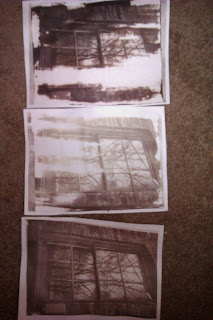
Arrowroot prints on top and the bottom is gelatin. Top had the most contrast but wasn't coated as well, same with the middle one. Because of this it was hard to distinguish differences in detail.


The previous class we tested the affect of using colored filters on the plain salted paper. Red, Blue, and Yellow cellophane was applied to one paper and the whole page was taken outside to be exposed.

The blue filter let the most light through, exposing the paper and producing a medium brownish color. The red filter blocked most of the light, only allowing it to be slightly exposed. The yellow filter blocked all of the light and left it white.